As I have run to schedule I thought it would be interesting to add further depth and development to the project by creating a 'mock' website for Big Bud. Although he is the owner of Soundtrax records and has a Myspace page, i thought it would be of interest to him to see the possibilities of having his own independent website.
Saturday
Friday
Drop
Wednesday
Stick'em
Promo Tees made


In order to get a quality and professional finish I worked in collaboration with ' T shirt printing london'. I chose the Gold foil finish on white and black as this was by far the most eye catching and most dazzling. Further updates of the tees shall follow
www.tshirtprintinglondon.com
Tuesday
Tees
CD cover/record Label
Backdrop arrives
Monday
Lights, transfers and confirmation
Sunday
Material (pvc) / Scale (6x6ft)
Thursday
I Luv Gold
Big Bud BlowUp
Wednesday
Big Bud Type II


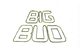
I came across this descriptive last night when looking for the definition of perspective. "The technique of representing three-dimensional objects and depth relationships on a two-dimensional surface". I thought this was really interesting, not only as an application toward design but also the ability of 'baffling' the eye and the mind with differentiating scales. I began by free handing the type within a perspective point and then tracing the basic outlines ready to be scanned, cleaned and added to the illustration. I felt by adding perspective would create a pathway leading toward the mouth of the lion, in turn manifesting the Lion illustration into a powerful, upright , symbolic statue of musical worship.
Tuesday
Big Bud Type


After 'tinkering' and flipping the illustration I felt it was important to incorporate Big Bud's name into the piece but make it apart of the illustration as opposed to an 'add on'. The overall composition is round and continuous, therefore I thought it would be best to add to this continuity. Under the chin of the Lion was a free space that had the potential of being filled yet not looking out of place. Today I shall create free form type and add it to the illustration.
Soundtrax Logo


The only essential inclusion in the backdrop was the Soundtrax logo. As I wanted to keep the simple line work I felt the gradient on the speaker behind the type hindered the overall effect so I chose to omit it, I feel this shall also be more legible for the crowd from a further distance without the distraction of the speaker making the type illegible.
Taking it to the computer
Subscribe to:
Comments (Atom)


